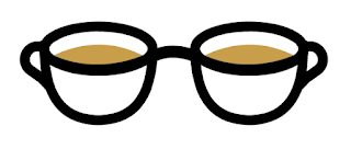
This sparked an idea to focus my branding around a cup of tea, but not just one cup, two to represent the two t's within my name. This also links in with my obsession with drinking tea on a regular basis.
First thoughts, design wise, were to have two tea cups with saucers and other little bits such as a tea bag and heat to make the visual of a cup of tea more obvious.
Straight away I chose colours to fit with the theme of tea since it wouldn't make sense to use other bright and abstract colours. The softer black/grey colour that I used was chosen simply to go with the soft colour theme already prominent with the two light brown and cream colours, as a solid black was too harsh against these colours.
Testing out a combination of these colours and the proposed logo made me realise how clustered it felt and especially considering this would need to be versatile enough to be visible at a range of sizes, it was way too over complicated.
Ultimately after taking out the extra bits on the mugs and leaving just the recognisable essentials, it developed into something that is more representative of me visually. Playing around with the arrangement meant that the shape of my glasses could also be incorporated into the logo, giving it more of an underlying concept.


No comments:
Post a Comment