This brief was a lot different to the other briefs I’ve done work for to date and so I think I struggled much more as I felt this is something that had to be perfected given it was to represent me as a designer and my way of working.
Looking at current pieces of self branding was definitely helpful during the design process as a whole as it allowed me to get to grips with the essentials needed within a brand. Those being a visual of some sort whether that be typographic based or a logo, or combination of the two but also an underlying theme or style in which you work, mine being this slightly less serious approach to introducing myself to people. This was done in the hope to bring out my character and personality more, rather than having the conventional name, job occupation and contact details.
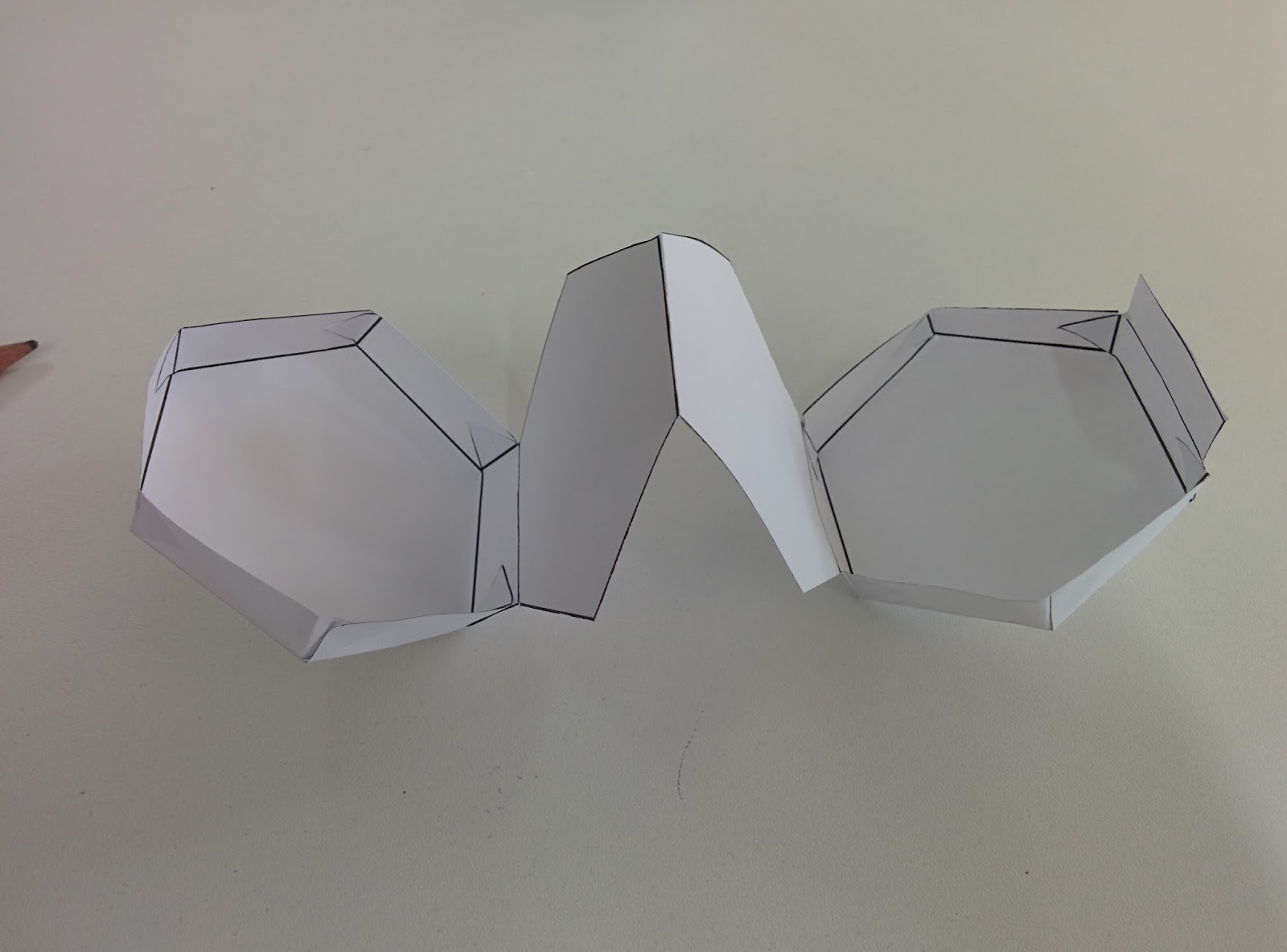
The whole design process of this brief has resulted in not only an established branding for myself but has meant I’ve got to grips better with certain processes. The main one being packaging and more hands on work since this is something that I’ve never really properly explored before, aside from within my Information Design Leaflet. Another thing I’ve explored more is photography, a big part of the whole process is to document on going work to show how my ideas come about, but also the photographing of the end products. Photography is something I’ve never done on previous courses and so getting to understand cameras and how they work in certain lighting conditions, environments etc has been a bit of a struggle but an interesting one at that.
I think that my final branding is very much representative of me. The combination of the colour scheme, typeface and also the style of the logo shows how neutral and simplistic my work is simply because of how I like to allow for the concept to shine through and be the prominent aspect rather than the design being purely aesthetic based.
My improvements for my branding would be to have possibly packaged all my branding together as a whole for the sake of ease when potentially sending it off to studios as individual, unorganised products may give off the wrong impression suggesting I’m not as organised as I could be. Plus as well it would tie everything together, the tea coaster, tea bags and business card as it would all be one bigger container.
Along with this another improvement would have been to make a bigger impact on social media, spreading my branding across several sites such as Instagram, Twitter, Behance etc. would have meant getting my name out there and putting a brand mark on my work so it’s instantly recognisable as me. Especially considering social media is a lot of design work revolves around and in, it would make sense to make a big push to get my brand out there.